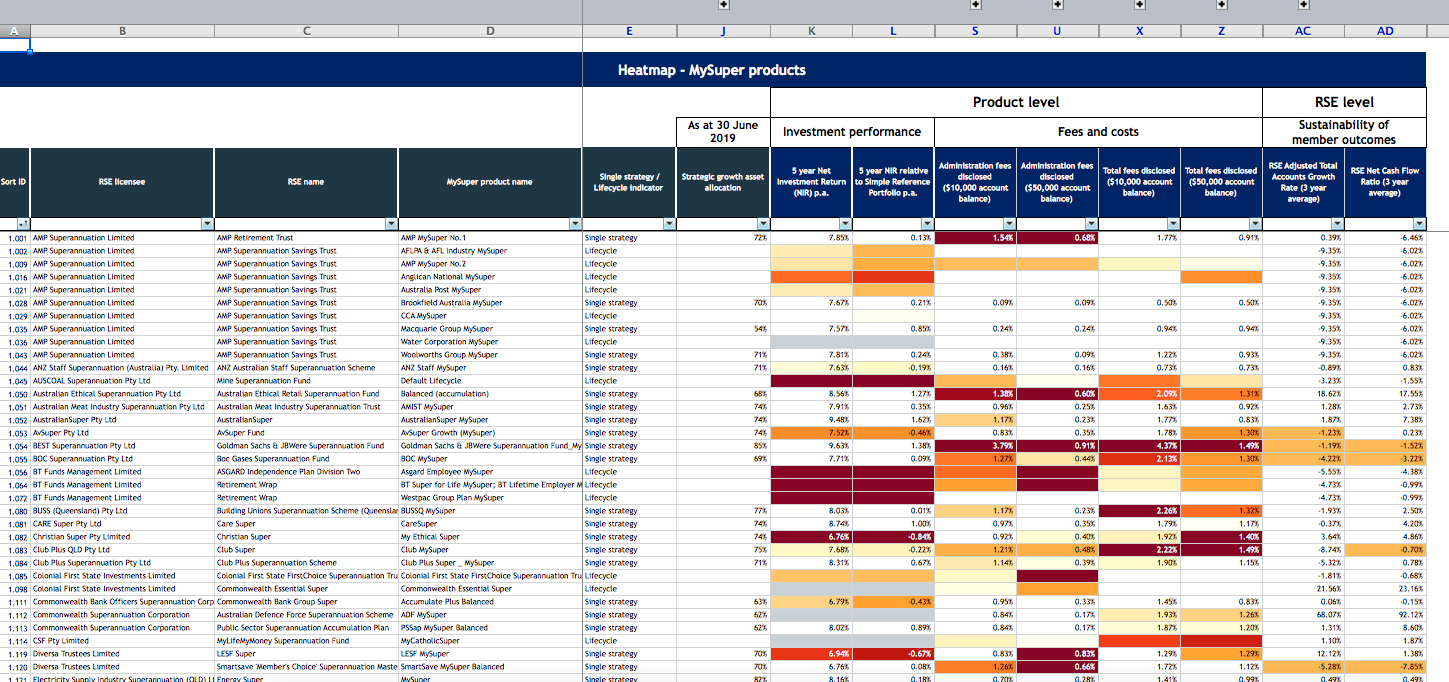
The superannuation fund regulator has signalled the start of new era of transparency in the sector with the release of its eagerly awaited heat maps. But is it actually helpful?
The Australia Prudential Regulatory Authority (APRA) tool is a colour-coded analysis of 410 MySuper products created out of mounting demand for a clearer understanding of the best and worst performing funds.
In what has been coined in many circles as “D-day for dud funds”, the heat maps take the form of an Excel spreadsheet that takes a little time for the average consumer (read me) to understand. I was expecting something much simpler.
I was relieved to see that superannuation researcher Alex Dunnin described them as “about as useful as an ashtray on a motorbike” for consumers wanting guidance on choosing the best fund.
But back to what they actually do reveal.
The analysis named AMP’s NM Super as the least sustainable fund with a 17.35 per cent decline in account numbers and negative cash flow of 9.66 per cent over three years to 30 June 2019, according to The Age.
Other funds with question marks hanging over their viability include Goldman Sachs & JB Were Superannuation Fund, Toyota Super My Super Growth and Victorian Independent Schools Super Fund-Balanced Option.
Among the worst performers based on financial returns are Westpac’s Group Plan MySuper, Christian Super-My Ethical Super, the Maritime Super Moderate Retirement Option and Perpetual Super My Super.
Not-for-profit industry funds in the top 10 that scored average or above across the eight indicators included HESTA Super, Media Super, Care Super, Electricity Supply Industry Superannuation (Queensland) and Motor Trades Association of Australia Superannuation. Non-industry funds that scored average or above in all criteria included AMP’s Brookfield Australia MySuper option and Equipsuper MySuper.
On APRA’s heat maps, the worst super funds are coloured crimson through to yellow, pale yellow and white. White indicates a MySuper product is performing around or above benchmarks for investment performance, fees and costs.
The heat maps are designed to emphasise underperformance and high fees, said APRA deputy chair Helen Rowell.
“Australia’s superannuation system delivers sound outcomes for most members, but APRA is determined to weed out the industry’s underperforming tail,” she said.
APRA estimates there is a six per cent difference in performance between the top and bottom funds over five years.
APRA’s aim is to turn up the heat on trustees that aren’t serving their members’ best interests, force them to lift their performance, reduce their fees or quit the industry.
But APRA’s methodology, including its decision to focus on three- and five-year performance benchmarks, has resulted in a queue of critics.
Association of Superannuation Funds of Australia chief Martin Fahy said that achieving sound investment performance was not measured in terms of years, but in decades.
Sally Loane, chief executive of the Financial Services Council (FSC), whose full members include super funds, financial advisers, the big four banks and AMP, said: “The heat maps may tell you that other funds have had higher returns over five years, but if you’re close to retirement you might be far more concerned with how your fund is managing the risks of a market downturn to safeguard your retirement savings.
“The heat maps don’t reflect that.”
The Australian Council of Trade Unions (ACTU) said that because the heat maps do not consider net return, they showed bank-owned funds performing more strongly than they actually are.
Have you looked at the heat maps? Did you find them easy to understand?
If you enjoy our content, don’t keep it to yourself. Share our free eNews with your friends and encourage them to sign up.
Related articles:
New super rules ‘confusing’
ATO’s lost super hotspots
Super fund of the year

