Decorating your home’s interior can be a fun and satisfying experience, but it can also be costly. When trying to save money, many people unknowingly make common decor mistakes that make their homes look cheap and uninviting.
Regardless of your budget, the aim is always to make your home more attractive. To ensure a successful result, take the time to avoid these eight mistakes that can make your home look cheap.
Cheap or flashy furniture
One of the elements in a house that draws the most attention is the furniture. Ideally, you should be choosing quality furniture that will last. Cheap furniture may feel like the way to go if you are on a tight budget, but it is often made of low quality materials that cannot withstand daily use. This can lead to furniture quickly looking worn, giving the impression of a poorly maintained home.
Instead, it is better to have a long-term outlook and invest in quality furniture that is built to last. You may pay more upfront for these pieces, but they will last much longer, and you’ll save money in the long run by not having to replace them as often.
Look for high quality vintage furniture at secondhand shops or estate sales if new pieces don’t fit in your budget. These pieces may have some wear and tear, but they are often built to last. With a little bit of cleaning and restoration, you can breathe new life into these pieces and make them the centrepiece of your home’s decor.
The wrong-sized rug

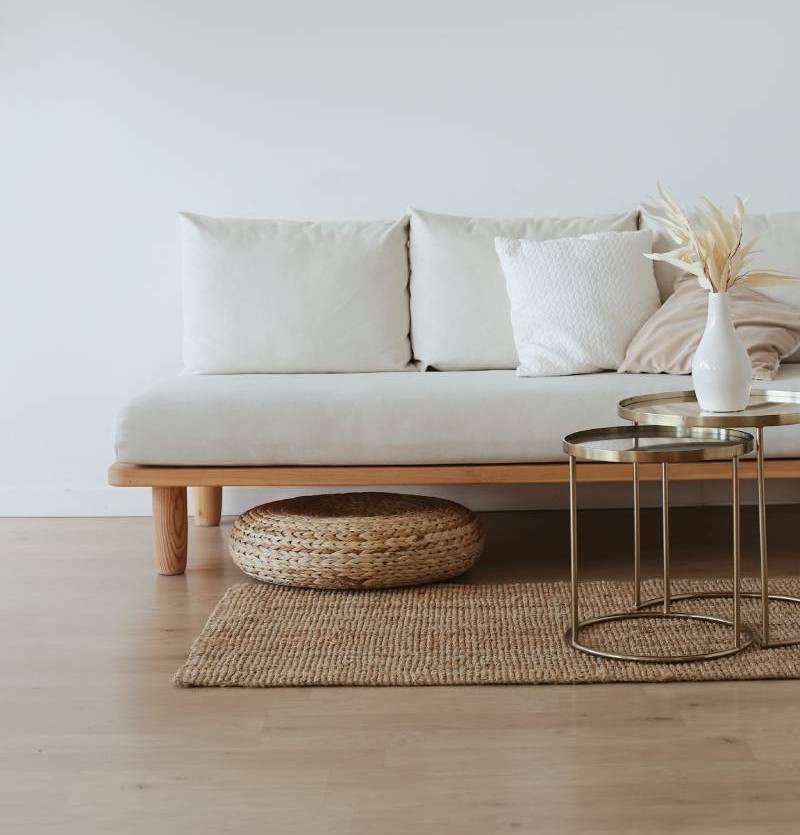
When picking a rug, make sure it’s large enough to fit right under your furniture so it is not simply floating in the room. A rug that is too large will make your space feel too full and cluttered while a too-small rug looks haphazard and makes the room appear incomplete.
Inconsistent themes
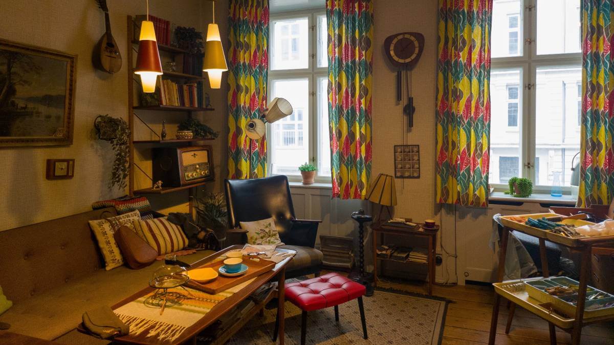
Sure, mixing different decor elements can add personality and interest to a room, but when this is done without a unifying theme, it can end up looking cheap, uncoordinated and chaotic. When mixing together different styles, it is important to choose pieces that have a similar colour, texture or theme to tie everything together.
A unifying theme can include common colour palettes, patterns or a specific style of furniture that reflects your personality.
Another way to avoid mismatched themes is to choose a few key pieces of furniture or artwork that serve as focal points in each room. The rest of the room can be built around this focal point, using complementary colours and textures to create a sense of cohesion.
Lots of mass-produced artwork
It’s often hard to find mass-produced artwork that perfectly fits your personal taste. Investing in original artwork by local artists or a print from a more well-known artist means you can add a personal touch to your home that shows your individual tastes and interests. Original artwork can also be a great conversation starter and help create a unique and memorable atmosphere in your home.
If you are on a budget, you can create your own artwork or hang up photographs of special memories.
Completely empty walls

Empty walls make a home feel unfinished, as if it hasn’t been properly decorated. Completely empty walls in a room can also look cold and uninviting, which can give the impression that the homeowner doesn’t care about their home.
A gallery wall is an easy (and inexpensive) way to fill a blank wall. Just be sure to limit the number of mass-produced prints to keep the look fresh and original.
Poor lighting
Lighting is a crucial element in any home, but it’s often overlooked. Poor or inadequate lighting can make a room look dim and dull, which can detract from the overall atmosphere of the home.
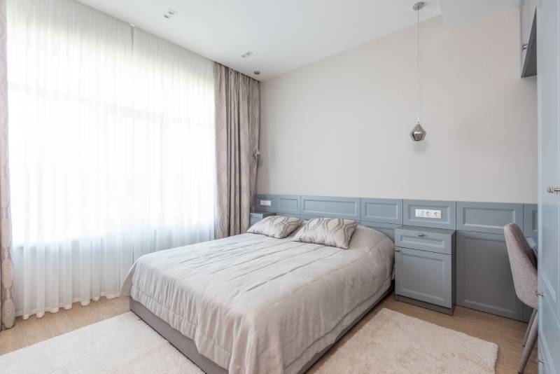
Poor lighting can also create harsh shadows and dark corners that can make the space feel uninviting. When choosing the correct lighting for your home, it is important to keep in mind the functionality of each room, the tone of each light and the mood you want to create. For example, it is better to opt for softer, ambient lights in the bedroom and go for brighter lights in the kitchen.
Accent lighting can add depth and interest to your space while also creating a more balanced and visually appealing atmosphere. It can also be used to highlight focal point items such as artwork or a special piece of furniture.
A packed entryway
It’s easy to toss odds and ends in your entryway when leaving or coming home, but that can spiral out of control. Ideally, the entry to your home should look polished and uncluttered as it’s the first thing visitors see.
Invest in some functional furniture that allows you to store your everyday belongings in an organised fashion.
Cluttered rooms
Excess clutter makes a space look chaotic and disorganised, whereas clean surfaces feel modern and inviting. When a home is cluttered, it can be difficult to appreciate the beauty of the room and the items that are inside it. Plus, when all of your items have a home, it’s easy to do a quick sweep and tidy up in a matter of minutes.
There are many ways to declutter and free up space in your home.
Are there any other decorating mistakes that you feel make a home look cheap? Why not share your thoughts in the comments section below?
Also read: Work the wow factor into your home


Pick the furniture that you like, irrespective of what others may think. Light your house the way you want to light it, may it be as bright as an Operating Theatre or dim as you feel comfortable.
It’s your home, furnish and light it to how you want and like, as you are the one living there.
After reading this article it just defines what alot of younger people want, the best of everything. Everything has to look like home beautiful, well unfortunately if you want to save money you need to be thrifty with it. We went without new furniture for years, the same the cars, etc. Everyone is different and will decorate their home to suit their taste, and yes it may look cheap to some people, but who cares, it’s their home not yours.